
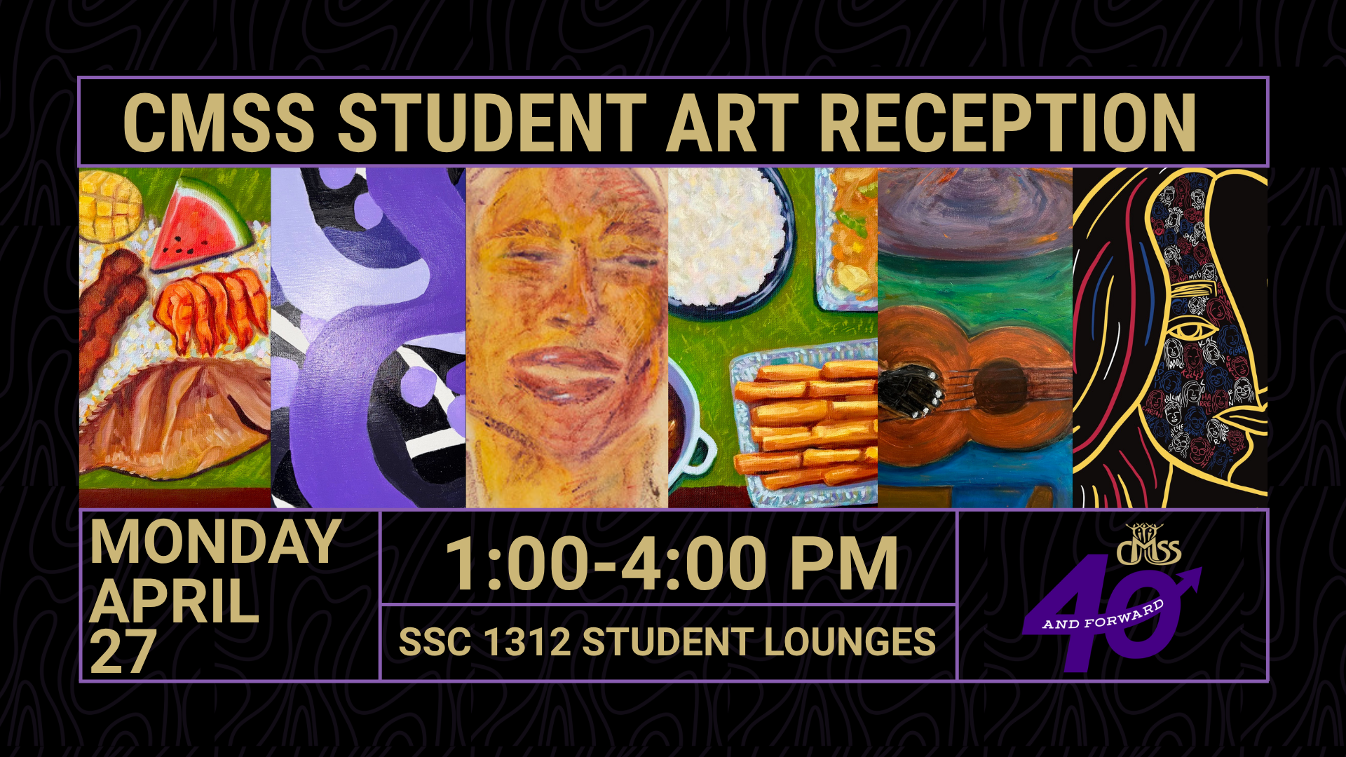
Celebrating Student Creativity
In honor of CMSS's 40th year and in an effort to make our spaces even more homey and welcoming for students, CMSS invited students to submit artwork for installation in our student lounges. Eight pieces touching on themes of community, pride in one's identities, togetherness, fellowship, student joy, and creativity were selected.
We are dedicated to ensuring our spaces are accessible to all who seek to use and enjoy them. The physical plaques for these pieces include Braille numbering which refers to corresponding numbered pieces on this page. Objective and subjective descriptions for each piece are also provided. An objective description is the factual portrayal of a piece excluding personal feelings or interpretations. A subjective description, on the other hand, allows artists to share their personal feelings, inspiration, and interpretation of their pieces, giving the audience insight into the artists' inner creative process.
Please enjoy the art and information about the artists and their pieces!
Selected Works
1. The Audacity of Hope, 2026
Conner Dawson (he/him) | Class of 2026
Photography
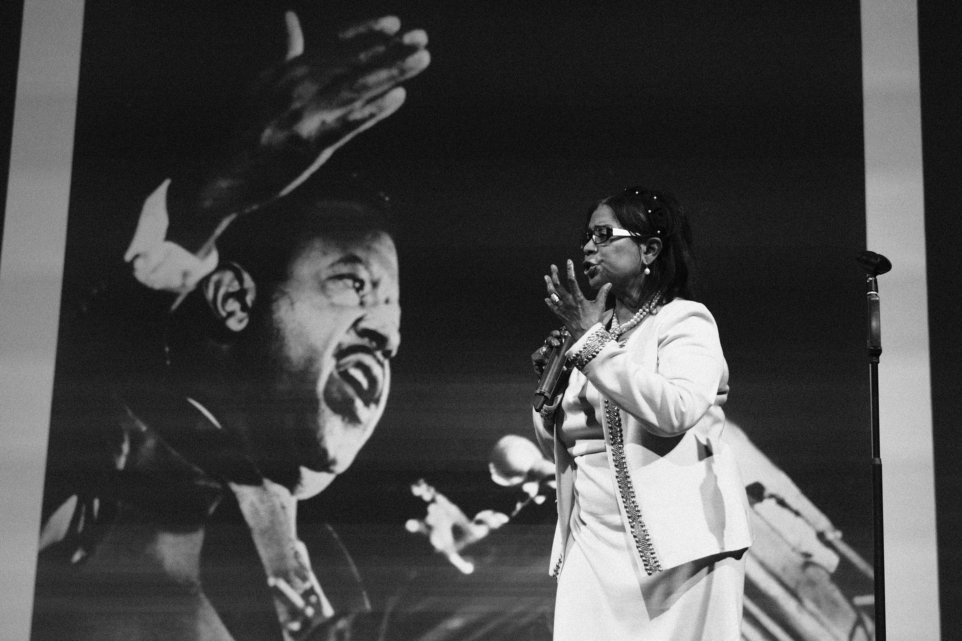
Conner is a multimedia artist, focusing on illustration, painting, and photography. His works center on the role of community and tradition in identity formation.
“History is not static; we are all active participants in it. Donzaleigh Abernathy is a testament to this. In her words, her presence, and her actions, she carries on the legacy of her father the late Reverend Abernathy and Martin Luther King. They live on through her, and through us.”
Objective description: Captured in a powerful moment of advocacy, Donzaleigh Abernathy - actress, author, and daughter of civil rights icon Rev. Ralph Abernathy - stands on the right side of the image. She speaks to an unseen audience with the same conviction that defined her family’s legacy, an expression of deep focus and determination on her face. Viewers can see her left profile as she stands in formal, white attire – a blazer with textured edges, a dress, and pearls around her neck. She wears glasses. Her straight black hair, pushed behind her ear, extends to her shoulder. The image stops just above her knees. Behind her on the left is the comparably powerful black and white image of her godfather, the late Reverend Martin Luther King, Jr., orating into a microphone. In this larger-than-life projection, we see his right profile as he, too, gestures passionately, facing Ms. Abernathy and similarly gesturing with passion to an unseen audience.
Subjective description: This visual bridge between generations serves as a reminder that the fight for accessibility and inclusion is a continuation of the broader struggle for human rights. Donzaleigh represents the vital intersection of heritage and modern activism, ensuring that the promise of "equality for all" includes every individual. In my quest to tell the stories of those who gave me my voice, I needed to turn to figures who have stood larger than life. Artists and activists often have served as a source of strength for me. Following their lead, I take a bold, daring, and invigorating approach to sharing my voice and vision with the world. My trips into its depths have been illuminating. Freedom is at the heart of my work. In the words of one of my heroes, Gordon Parks: “I suffered evils, but without allowing them to rob me of the freedom to expand.”
2. I Am Because of You, 2026
Bella Cabaccan (she/her) | Class of 2026
Digital Media
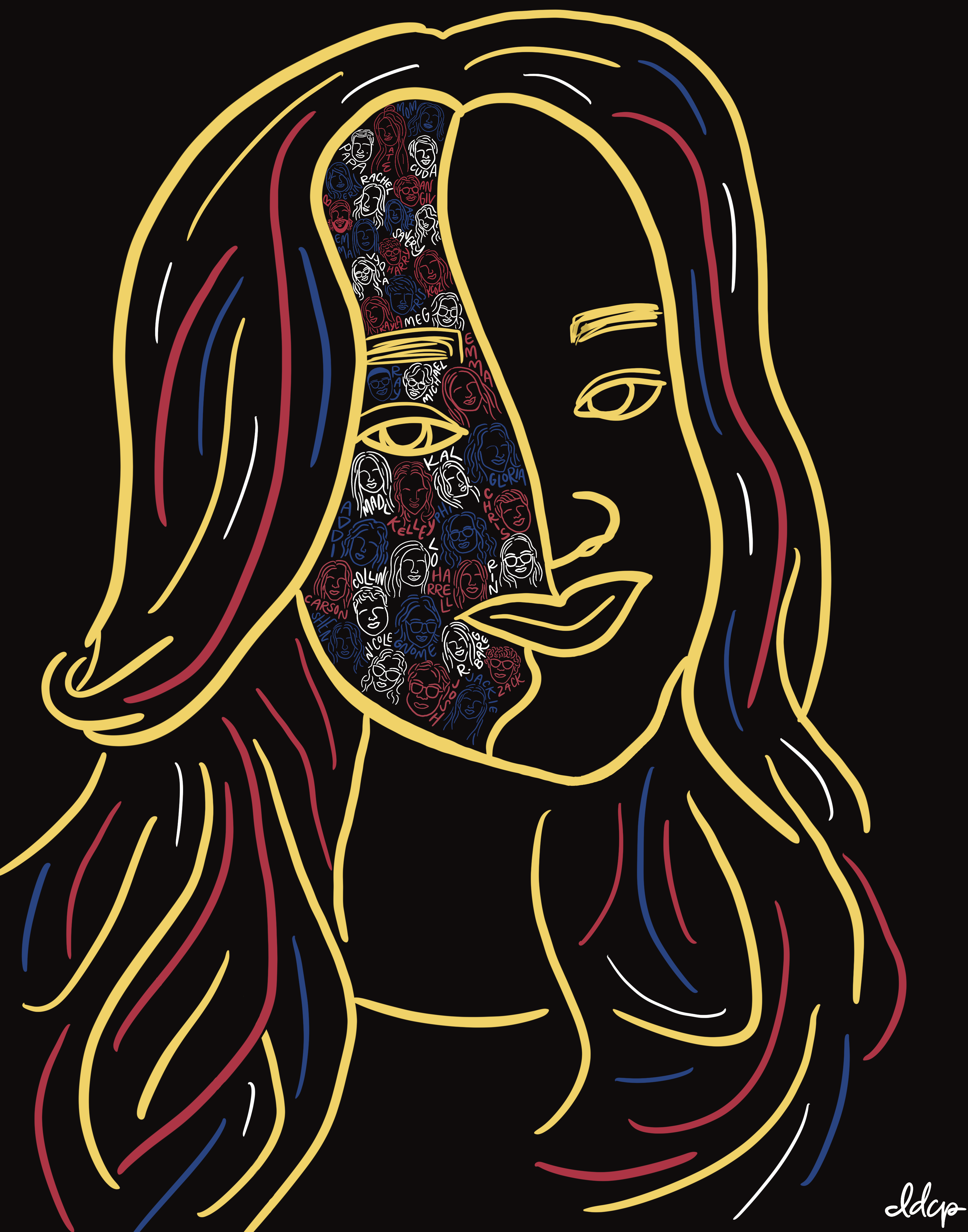
Bella enjoys creating art that makes herself and others smile!
“I am not Me if not for my people and my Filipino heritage.” This piece features thirty-nine of the most influential individuals in the artist’s life, with the colors of the Filipino flag also represented.
Objective description: A contour drawing of Bella Cabaccan's face and hair utilizing the Filipino flag colors: Golden Yellow, Royal Blue, and Crimson Red. She is staring directly at the viewer. The portrait showcases her neck to the top of her head. Bella has a smile on her face. Alternating between colors of blue, red, and white are smaller contour portrait drawings of 39 individuals. These faces have corresponding names and are positioned inside the left half of Bella's face. The background is solid black.
Subjective description: Through artistic expression, I am able to creatively show deep gratitude for the impactful individuals in my life. The faces and names filled my heart with joy and love, remembering the memories I have had with each person as I drew them. Each member challenged me to become a better version of myself. Without them and my Filipino heritage, I am nothing. I am lucky to live in these individual's timelines, and I am happy they are in mine. I am proud of this piece and everything it represents. The concept is inspired by the Filipino Americans at Madison's motto: I Am Because We Are."
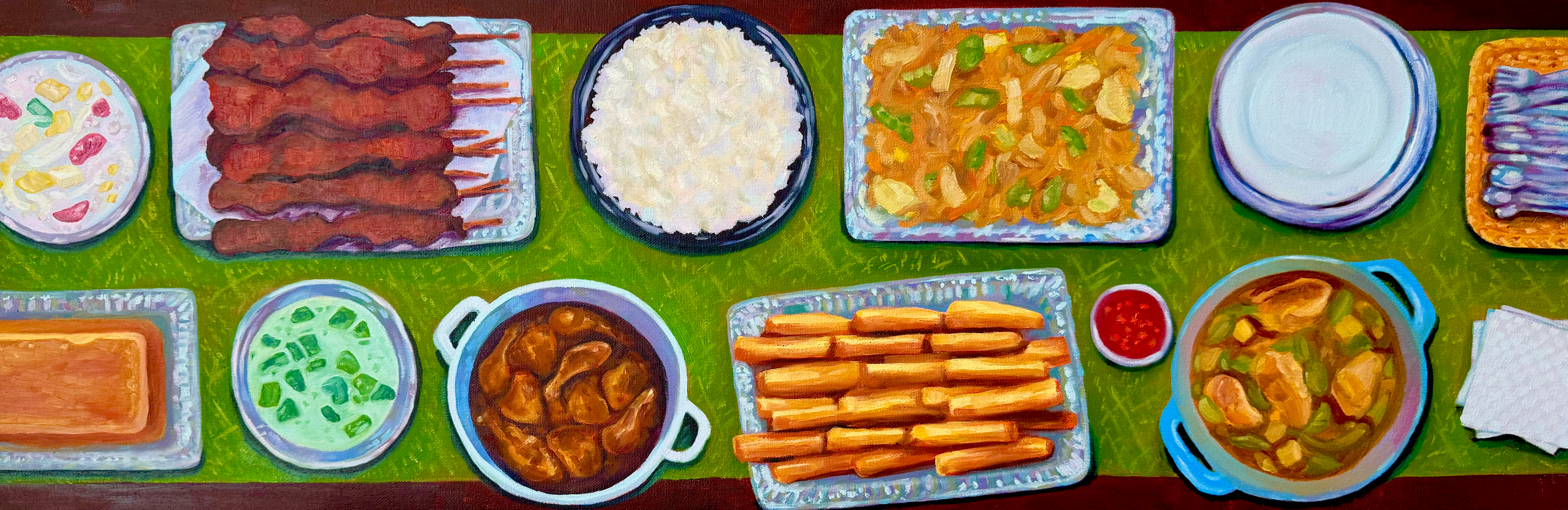
3. Boodle Fight, 2025
Francesca Mehegan | Class of 2026
Oil Paint
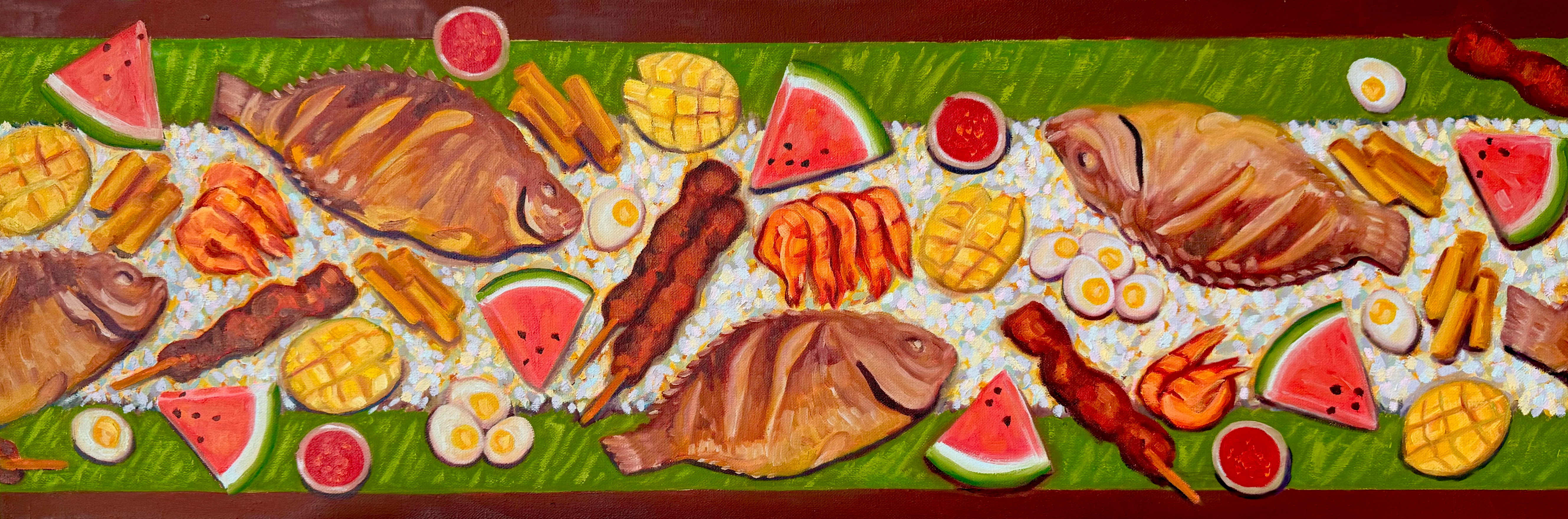
Born in the Philippines and raised in Harrisonburg, VA, Francesca is a senior majoring in Media Arts & Design with a concentration in Creative Advertising and minoring in Art.
This oil painting depicts a traditional feast where Filipinos stand shoulder-to-shoulder and eat Kamayan style using their hands.
Objective description: This piece is a horizontal panel and a diptych where the first painting is of a boodle fight, also known as a kamayan feast. The tradition started with Filipino soldiers sharing an abundance of food. It’s practiced with everyone standing shoulder-to-shoulder and eating kamayan style: with their hands. Banana leaves are placed on the table instead of plates, and Filipino meats, veggies, and fruits are placed along a bed of rice. This boodle fight features fried tilapia, shrimp, salted eggs, pork barbecue skewers, lumpia (fried spring rolls), lumpia sweet chili sauce, mangoes, and watermelon. The painting displays the feast from above. The tilapia, painted in warm brown tones, are sliced diagonally with warm yellow strokes. Shrimp are dispersed in groups and depicted in warm red, yellow, and orange tones. Spring rolls, also painted in the yellow, orange, and red tones, are dispersed in small groups across the table, as are vertically sliced groups of hard-boiled eggs, depicted in white and a warm yellow. Triangular slices of reddish-pink watermelon with green and white rinds are scattered throughout the table as are lumpia, depicted as cylinders in yellow and warm orange and brown tones. Mango, sliced in a grid-like pattern, are mostly yellow with amber tones between the chunks. Small condiment cups of red sweet chili sauce are also dispersed across the table. All foods lay on a bed of white rice which runs down the center of the table. The rice is spread atop a layer of green banana leaves. All aforementioned items and food lay atop a maroon surface.
Subjective description: This painting feels alive with movement and energy, capturing the spirit of togetherness that defines a boodle fight. The overhead perspective places the viewer directly into the gathering, as if they are about to reach in and join, reinforcing the intimacy of eating shoulder-to-shoulder. The repetition and scattering of food across the surface create a sense of generosity and shared experience. The vivid reds, yellows, and greens pop against the maroon background, giving the composition a celebratory warmth that mirrors the liveliness of the tradition itself. The banana leaves and communal layout remove any sense of separation, emphasizing connection among those gathered.
4. “Fil-Am” Potluck, 2025
Francesca Mehegan | Class of 2026
Oil Paint
Born in the Philippines and raised in Harrisonburg, VA, Francesca is a senior majoring in Media Arts & Design with a concentration in Creative Advertising and minoring in Art.
This piece features a modern Filipino potluck painting with fruit salad, pork barbecue, rice, pancit, leche flan, buko pandan, adobo, lumpia, and tinola.
Objective description: This painting is of a modern Filipino potluck. Since I was a kid, my mom’s extended family has hosted many potlucks. The whole table would be covered in all of my favorites: lumpia, tinola (ginger chicken soup), leche flan, buko pandan (jelly dessert), adobo (chicken in soy sauce and vinegar), and pancit (noodles). In the painting are featured a variety of dishes, all of which are viewed from above and lay on a bed of white rice which runs down the center of the maroon surface. The rice is spread atop a layer of green banana leaves. The top row of food from left to right includes the buko pandan (red, green, and yellow foods sitting in a white jelly in a circular dish), skewers depicted in deep red tones, white rice in a circular navy dish, pancit (yellow and green foods mixed in a mixture of orange strokes), a stock of circular white plates, and a basket of silver utensils which runs off the edge of the painting. The bottom row of food from left to right begins with the leche flan (a warm variety of browns with the top edge of the dish shown in yellow) which enters the painting from the left, buko pandan (a light green mixture with verdant green chunks spread throughout), adobo (chicken legs and thighs soaked in a brown sauce in a pot), lumpia (cylinders in yellow and warm orange and brown tones), a condiment cup of red sweet chili sauce (a deep red sauce with dark orange elements), a pot of tinola (a soup made of chicken, depicted in brown tones, and green vegetables), and a stack of white square napkins which runs off the right edge of the painting. Each oil painting is 12” x 36”. Long canvases helped convey the idea of a community feast instead of a simple family meal. I used similar bright colors in this project to show that it’s about Filipino tradition, similar to the ideas of the previous painting (Boodle Fight).
Subjective description: The painting feels warm and communal. The overhead perspective invites the viewer into a shared space, as if standing among family, looking down at a table that holds not just food but connection. The vibrant colors and repetition in the shape of dishes create a sense of rhythm and familiarity, echoing the comfort of traditions that return again and again. The bed of rice flowing through the center acts almost like a unifying thread, visually tying each dish, and each person, together. The piece captures more than a meal. It conveys a sense of belonging, where food becomes a language of care, identity, and shared history.
5. Players Only Love You When They’re Playing, 2024
Conner Dawson (he/him) | Class of 2026
Oil Paint
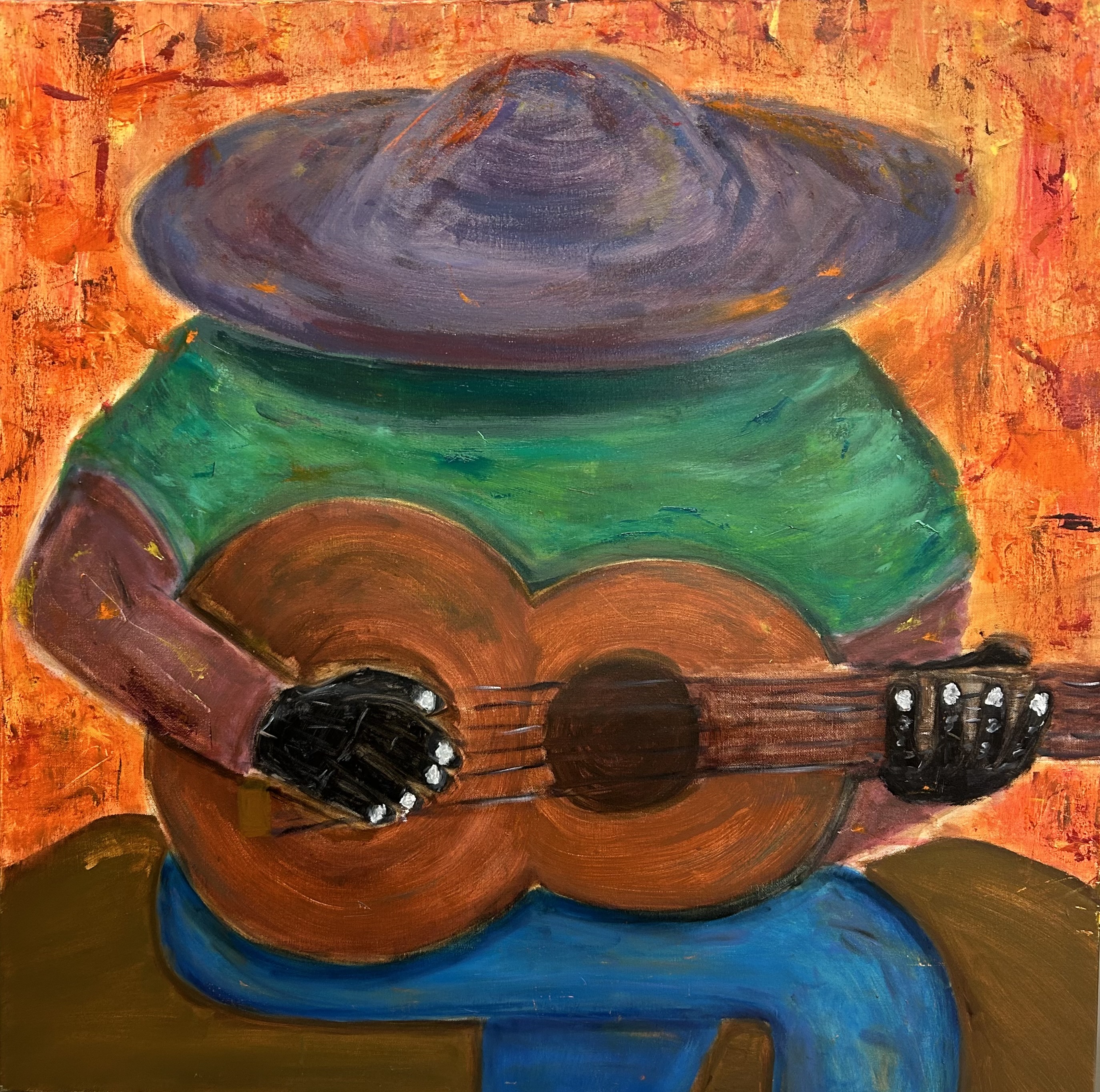
Conner is a multimedia artist, focusing on illustration, painting, and photography. His works center on the role of community and tradition in identity formation.
As an artist and athlete, Conner loves the flow state “to my own detriment; the world could be burning down all around me, and still I play. This piece seeks to capture the way that we have our Heaven we turn to when it seems like Hell is all around us.”
Objective description: This expressionist painting depicts a musician in a wide-brimmed hat, deeply immersed in their craft. They are wearing a purple hat with a green poncho and a pair of jeans. They sit on top of a rock in the midst of fire. The central focus is the musician’s hands, which navigate the strings of an acoustic guitar. Set against a warm, textured backdrop of oranges and reds.
Subjective description: As an artist and athlete, I love the flow state. This is often to my own detriment. The world could be burning down all around me, and still I play. This piece seeks to capture the way that we have our Heaven we turn to when it seems like Hell is all around us. This was one of the first oil paintings that I ever made, my second, to be exact. It took me a while to really see myself as an artist. Making this one felt like the moment of acceptance. Me fully taking on the role that I will play for the rest of my life. As an athlete, I have a shelf life; one where the clock is always ticking down on my day of being no longer able to compete. As an artist, my journey is just getting started, but I do not know if I will be able to let go of the competitiveness that comes with Sports. What I love about being in the Zone is that all of those questions slip away, and in the brief moment of eternity… I am free.
6. The Hattery, 2026
Ester Nasi (she/her) | Class of 2027
Oil Pastels
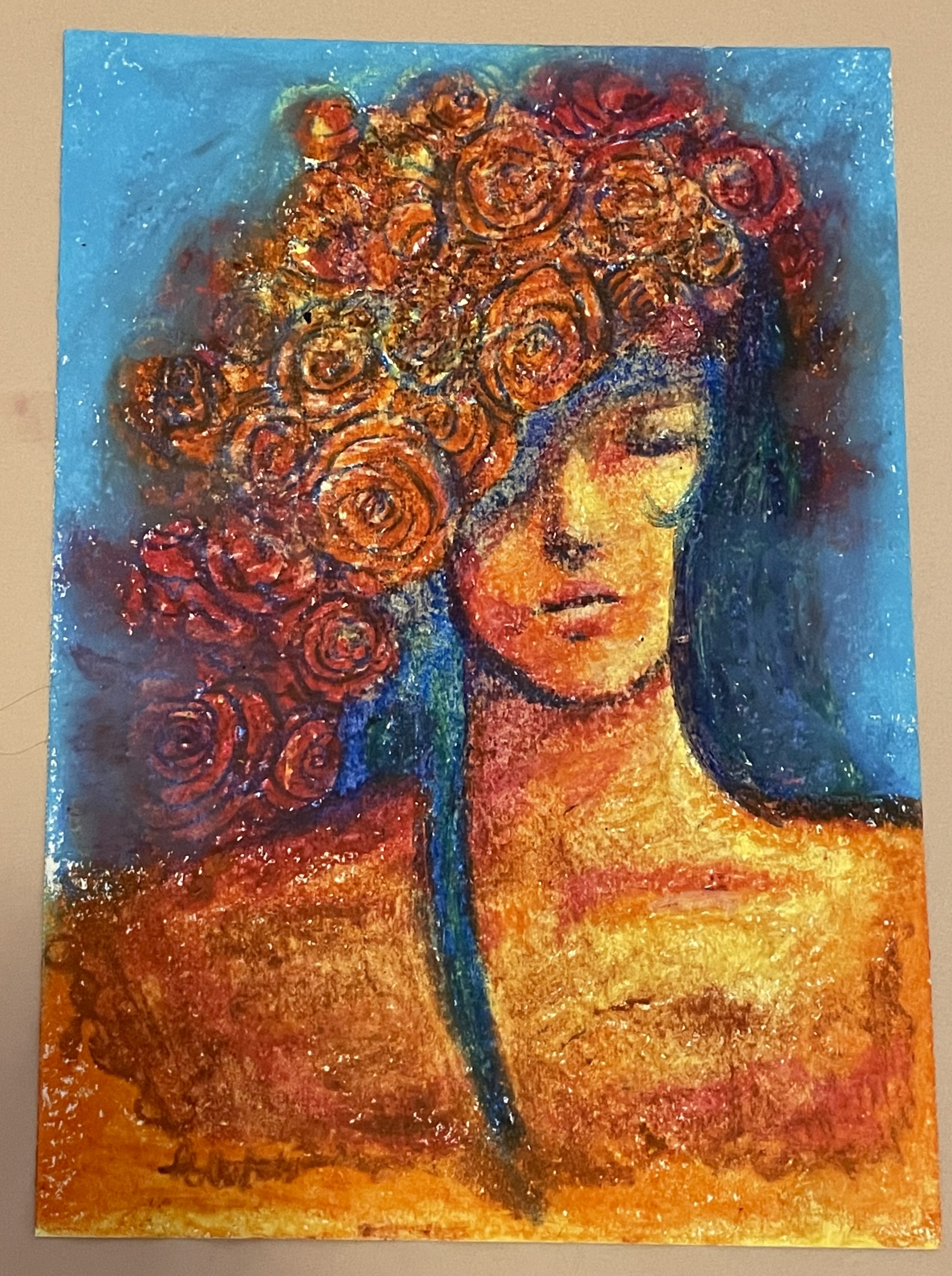
Ester is a local portrait artist exploring the human experience through character-focused pieces.
This piece shows a semi-abstract portrait of a woman donning the flora as a hat.
Objective description: A semi-abstract portrait in oil pastel. An unnamed woman dons flora as a hat, expressed in bright, contrasting colors. The darker reds and blues of her hat and hair blend into the bright blue background, and the warmer colors of her skin fade into a darker red-orange hue. This blurring vignette effect focuses attention on the brighter center of the piece and her resting expression.
Subjective description: The work is very bright and colorful and heavily employs contrasts. The bright oranges and yellows clash with the blues and purples, creating a bold, loud tone. However, this intensity contrasts with the subject’s relaxed expression. Inspired by Spanish Flamenco dancers, this dichotomy is meant to emphasize individual beauty. Hats also lend themselves well as symbols of empowerment, like a crown one chooses to wear rather than one given. Overall, the work reflects acceptance of inner power and balance.
7. Subconscious Structure, 2023
Najah Waters (she/her) | Class of 2028
Acrylic Paint
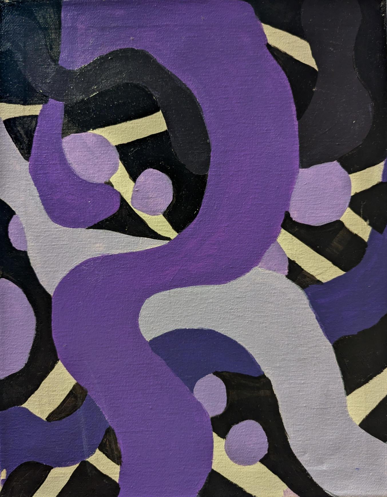
Najah is a multimedia artist who experiments to express and understand herself. Though she is a photography major, she mostly spends her time drawing and painting. Najah is currently collaborating with local artists to create murals for the community, but you can find her creations displayed throughtout Harrisonburg.
This piece is an abstract painting created using various shades of purple.
Objective description: This abstract painting is composed mainly of various shades of purple, ranging from white and a lighter lavender to deep plum tones. The composition features a mixture of rigid vertical stripes, circular blob-like forms, and fluid, curving shapes that move across the canvas. Near the center, two major flowing shapes, one lighter and one darker, create a strong visual contrast that immediately draws the viewer’s eye.
The rigid stripes appear structured and controlled, while the more rounded and organic shapes introduce softness and movement. The overall layout creates a balance between geometric order and natural irregularity. The brushstrokes and texture suggest layered acrylic paint, with subtle variations in opacity due to reusing leftover paint from a paint-by-numbers set. The piece gives off a reflective, contemplative atmosphere through its interplay of strict lines and gentle, drifting forms. The flowing shapes stretch diagonally and horizontally, giving the appearance of movement across the canvas.
Subjective description:
Mood and Meaning: This piece gives off a reflective mood. The contrast between the rigid lines and the flowing shapes makes me think about structure vs. chaos, and how those two forces interact in my life.
Focal Point: My eye is drawn to the contrast between the two fluid shapes near the center, the lighter and darker colors meeting feels like a moment of tension and harmony all at once.
Personal Context: I painted this during a time I was struggling with my self-image, especially within my friendships and relationship. Art was one of the ways that I processed those feelings.
Emotion Now: When I look at it now, I feel nostalgic. I used to make a lot of art during that period, constantly expressing myself through creating. This piece reminds me of when I was just starting to understand how to be more authentic and true to who I am.
8. Queer Black Joy, 2023
Margaret Wiwuga (they/them) | Class of 2026
Oil Pastels
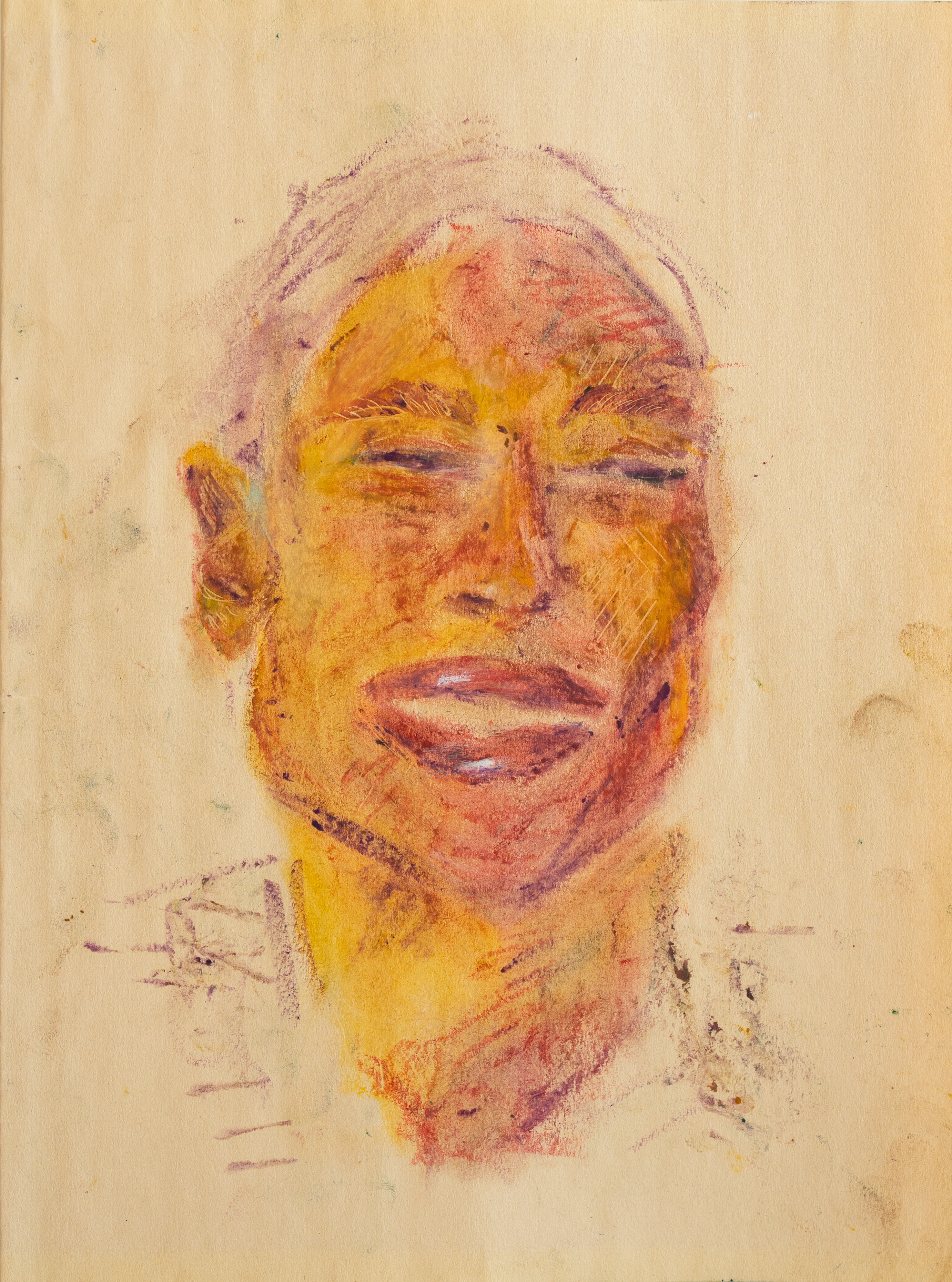
Marge is a queer, Black, multiracial, first-generation college student, child of an immigrant, and HUMAN opposed to hate, bigotry, ignorance, and prejudice and dedicated to making the world a better place as a mental health counselor.
Surprisingly to the artist, the original of this piece was their first experimental use of pastels. Utilizing their background in sculpture, Marge added texture throughout the piece with sculpting tools.
Objective description: A portrait in vibrant yellow, purple, and more subtle pink oil pastels depicts the artist, Margaret (Marge) Wiwuga, from the neck upward. Their eyes appear closed as they beam with slightly parted, full lips, facing just left of the viewer in a way that completely obscures the left ear. Throughout the piece, warm yellow tones highlight well-lit areas of the subject and purple tones are used for shadows. Deep to slightly pinker purples define the edges and shadows of their face, such as their jawline, nostrils, eyebrows, ears, and the shadows of their neck. The soft cream of the page shows through the shapes of the artist's implied crewneck shirt and short hair. These areas are scarcely shaded, if shaded in at all. Throughout the piece in areas such as the eyebrows, cheek, and ear, thin etches interrupt purple and ochre layers to reveal a wheat yellow beneath, contributing subtle texture. The piece seems to emanate relaxed joy.
Subjective description: This piece emanates tranquil joy – or gaiety, if you will. The subject – the artist themself, a person of color with full lips, short hair implied by smudged purple outlines, and textured purple eyebrows – beams with high cheekbones, relaxed facial and shoulder muscles, a prominent right ear, and seemingly closed eyelids facing slightly left of the viewer. Purple tones define the individual’s features with pinks used for shading and a variety of rich ochre tones used for their skin tone. Smudges throughout the background of the page convey a relaxed creative process and a certain comfort and freedom in simply creating.