
Thoughtful use of color in digital design is essential for creating accessible experiences for all users. Ensuring sufficient contrast between text, images, and backgrounds makes content readable for people with low vision or color vision deficiencies. Additionally, information should never rely on color alone—for example, using only red and green to indicate status—since users who cannot distinguish these colors may miss critical cues. By combining strong contrast with additional visual indicators, such as text labels, icons, or patterns, digital content becomes clearer, more inclusive, and easier for everyone to understand and use.
Expectations
Color contrast is the difference between two colors; the color used in the background and the foreground.
Designers must provide enough contrast between text, images of text, and background colors so that information is legible to people with a wide range of vision abilities. The following contrast ratio minimums are specified to ensure that essential content and interactive elements remain perceivable:
- Normal text (under 18pt, or 14pt bold): Minimum contrast ratio of 4.5:1 between the text and its background
- Large text (18pt+, or 14pt+ bold): Minimum contrast ratio of 3:1 between the text and its background
Color reliance occurs when information is conveyed using only color, which creates accessibility barriers for people with visual impairments, including color blindness, low vision, or blindness.
Designers must avoid relying on color as the sole way to convey information or distinguish elements. Instead, providing additional visual cues—such as text labels, underlines for links, patterns, shapes, or icons—can ensure that meaning, function, and status are clear when color alone is not sufficient.
Why Color is Important
Thoughtful use of color is a key part of accessibility. Ensuring sufficient color contrast and avoiding reliance on color alone helps people with different types of vision perceive, understand, and interact with content.
Color contrast and use impacts:
- Individuals with color perception deficiencies: High contrast and avoiding color reliance ensures that key information remains visible and understandable regardless of color perception.
- Users with low vision: Many users struggle to distinguish subtle color differences, especially when contrast is low. If the only distinction between two elements is color (e.g., active vs. inactive buttons), the difference may not be apparent.
- Readability: Strong color contrast improves legibility in all environments—whether in low light, on older monitors, or on mobile screens in bright sunlight. When color alone is used to signal meaning (e.g., red text for errors, green for success), people with color vision deficiencies may not be able to distinguish the difference.
- Comprehension: Low-contrast text strains the eyes, making it harder to focus, read, and process information. Relying solely on color to group, highlight, or differentiate information can cause confusion.
- Cognitive load & fatigue: High contrast reduces visual effort, supporting comfort and sustained reading over time. Users with low vision or color blindness may spend extra effort trying to interpret color cues, which increases mental strain.
How to Implement
Check your color contrast with a contrast checker if using color combinations other than black and white or accessible JMU color combinations.
Quick Tips:
- Use online tools (e.g., WebAIM Contrast Checker or browser plugins) to verify that your text, icons, and graphics meet the minimum contrast requirements.
- Do not use color as the sole way to convey information (e.g., red for errors, green for success). When necessary, add additional cues such as text labels, underlines, patterns, or icons to ensure meaning is accessible to everyone.
- View designs on different devices, lighting conditions, and screen types to ensure readability and clarity.
- When using graphs and charts, communicate results in BOTH color and text.
- Create hyperlinks with a different text color than the main body text. Underline hyperlinks as well.
How To: Check Color Contrast using WebAIM
The WebAIM Contrast Checker makes it simple to evaluate the contrast between foreground and background colors in a design:
- Open WebAIM's Contrast Checker: https://webaim.org/resources/contrastchecker/
- Enter the foreground and background colors:
- Type the hex value (if known), or
- Use the color picker’s eyedropper tool to sample a color directly from your screen
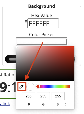
- Review the results and check compliance: The checker displays the contrast ratio and shows pass/fail results for different WCAG success criteria. For ADA Title II and WCAG 2.1 Level AA compliance:
- Normal text requires at least 4.5:1 contrast
- Large text requires at least 3:1 contrast
Example 1: Low-contrast text on solid background
In this example, text on a solid background is difficult to read without sufficient contrast.

Problem:
The text colors used in this infographic do not have sufficient contrast, making the content hard to perceive.
- BOTH the "#27" statistic in light purple and black text have a contrast ratio of 1.58:1 against the dark purple background.

Solution:
Increasing the contrast ratio between the text and solid colored background makes the content easier to perceive. By adjusting the colors used on the dark purple background, there is now sufficient contrast:
- The "#27" statistic in gold has a contrast ratio of 6.61:1 on the dark purple background.
- The white text has a has a contrast ratio of 13.23:1.
Example 2: Low-contrast text on background image
In this example, text is being displayed on top of a busy background image.

Problem:
Text displaying on top of a busy background image with several background colors does not have sufficient contrast, making it difficult to read.

Solution:
By adding a purple overlay to the background image, the text now has sufficient contrast against the lightest portions of the image and it is easier to perceive.
Note: Text over gradients, semi-transparent colors, and busy background images still needs to meet contrast requirements, but WCAG does not provide guidance on how to measure their contrast. We recommend testing the area where contrast is suspected to be lowest.
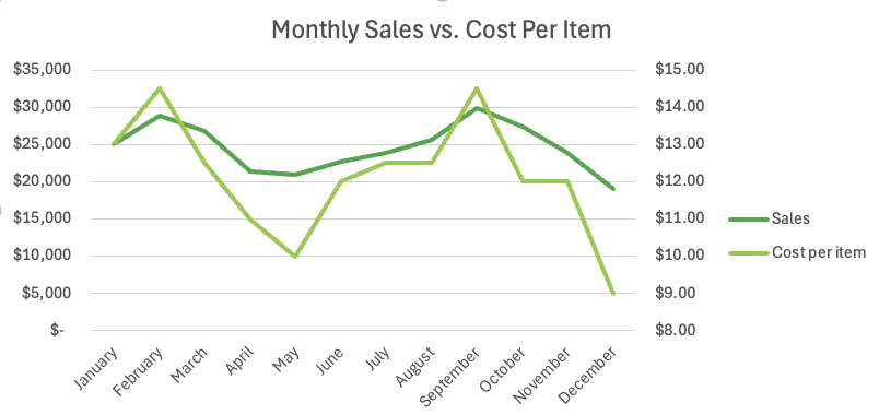
Example 3: Avoiding color reliance
In this example, important information is being conveyed using color alone, creating ambiguity if someone is unable to perceive the color differences.
Problem:
In this first image of a line graph, "Sales" and "Cost Per Item" are both green lines. Should an individual have difficulty perceiving the color green or the different shades of green, then the visible information may be confusing (ie. which line depicts which data point?).
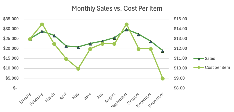
Solution:
Rather than relying upon color alone, unique identifying markers are used to help differentiate between the lines for "Sales" and "Cost Per Item".
WCAG Success Criteria
Meeting all of the above requirements (must statements) ensures that the use of color and color contrast is in compliance with WCAG 2.1 (AA) as they relate to the following: