
Introduction
Microsoft Word is the most common word processing program on the market. It only takes a few simple steps to ensure that a Word document is accessible to everyone.
Some things to consider when creating documents:
- Styles/Headings
- Outline format
- Table of Contents
- Alt text/Captions
- Describe hyperlinks with alt text
Design your material with an Outline mindset
A screen reader will provide for a user to scan or read material quickly by tabbing through the headings and hyperlinks if they are setup correctly. To improve accessibility, design material using an outline basis and provide meaningful, distinct names for links that make sense when read out of context. Without page structure, it is difficult for users with disabilities to quickly navigate documents.
Whereas a sighted user can “scan” through a screen of text instantly, a screen reader will read through the text line by line. A properly formatted page with styles can allow a screen reader to scan through topics or sections much quicker.
Styles
Styles create a page structure that screen readers can easily interpret allowing a user to navigate through a document quickly. The default heading styles must be used for this to function. Do not simply enlarge a font and/or make it bold to make it appear like a heading style: a screen reader will not recognize it as a heading without one of the Heading styles applied to it.
Heading and paragraph styles help make your document easier to read and provide navigation points for users on a screen reader or those who need a visual cue.
Tips for using styles:
- Use headings in the correct order (H1, H2, H3)
- Avoid long headings, whenever possible. Headings should be short, descriptive titles.
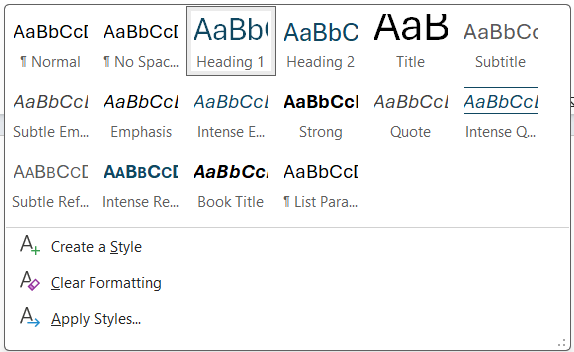
HOW TO: Add Styles to your document:
Windows & Mac Users:
- Place your cursor in the text that you wish to add a header style to.
- From the Home tab on the ribbon, select the style you wish to use in the Styles menu.
Custom Headings: It is best to use one of the built-in heading styles and not create your own. If you would like to change a style, do so by modifying the built-in styles. A screen reader may have issues understanding a new style but can easily interpret built-in styles.
Table of Contents
A table of contents assists all users in navigating a longer document. If you have used style headings when creating your document, adding a table of contents requires only a simple click of a button.
HOW TO: Add a Table of Contents to your document:
Windows & Mac Users:
- Create your headings using the built in style headings.
- Under the references tab select Table of Contents.
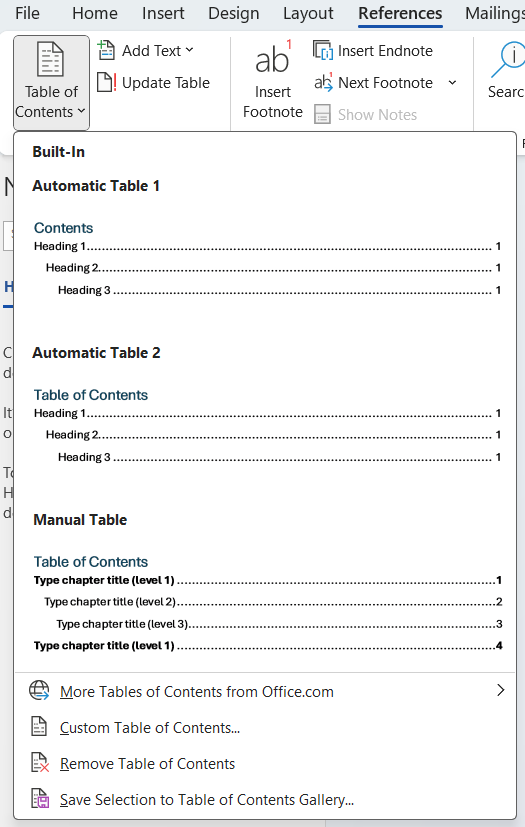
- Select a Table of Contents style.
- Word will automatically create a table of contents based on your Heading Styles.
NOTE: You can navigate to a specific section in the document from the Table of Contents by Ctrl+click on the section you wish to jump to,
Outline View
Using styles to create your content will also assist the creator with managing large documents and may assist all learners with cognitive organization of your material. If you have used styles while creating your document you can easily navigate and arrange the content in outline view.
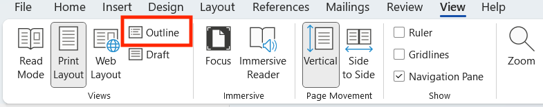
To see your document in Outline View, navigate to the View tab and click Outline.
Paragraph Styles and Page Breaks
Avoid using blank lines to separate paragraphs or pages in a document. A screen reader will read these as “blank” and the user may think that they have reached the end of the document.
To begin a new page, use page/section breaks rather than entering multiple blank lines.
Tip: Ctrl+Enter will add a page break for you.
Alt-Text
Alternative text, also known as alt text, often appears when you move your pointer over a picture or object on a website. Screen readers also read alt text to users to educate them on what an image, object, or table contains.
Alt text should be accurate and descriptive, but it does not need to include what type of object was created (image, chart, table, etc.), as the screen reader will automatically convey this.
Writing Alt Text
Use clear, but concise, descriptions. For example, “a red Ferrari” tells the reader more about the image than “a car.” However, “a 2009 cherry red Ferrari 599 GTB Fiorano displayed in a darkened showroom floor with spot lighting from directly above casting a light shadow on the lower 17% of the car” may be excessive depending on the circumstances.
The description should provide the information a person needs to know about the object to make it relevant to the content. A table or chart may have much more description than an image.
What is a decorative image?
An image that does not convey important content or is for aesthetic purposes only. Decorative images do not require alt text. A general practice is to put “” on an image that does not require alt text so that a screen reader knows alt text was left out intentionally.
HOW TO: Adding Alt Text to an Image:
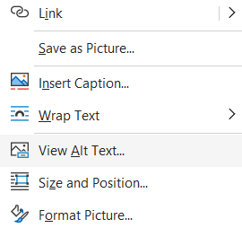
Windows & Mac Users:
- Right-click the image and select View Alt Text…
- An Alt Text textbook will appear, which may be auto-filled by Microsoft’s built-in AI service. Edit or enter a description of the image into the box or check that the image is a decorative image, in which case no description is needed.
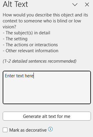
NOTE: Review any AI generated alt text before using it. In many cases, the AI generated alt-text is not sufficiently descriptive or may be incorrect.
Captions vs. Alt Text
In addition to alt text, captions can be added to tables, charts, and images. A caption will typically appear directly below a table, image, chart, or picture. Captions can be indexed by creating a table of captioned items at the end of the document.
If I have a caption, do I need alt text?
Alt text is valuable to a person who is hearing the object described via a screen reader. Captions are beneficial for everyone, but captions do not replace alt text. Captions are not required for accessibility, but alt text should always be used with an object that provides value outside of being decorative.
For example, if there was a table in your content showing growth of electronics in households from 2010 to 2012, your alt text may say “Electronic use grew 142% between 2010 and 2012.” Whereas a caption might say “Chart 1.1 Growth of Electronics” above or below the table. A caption can be viewed more as a title where alt text is a description.
Hyperlinked Text
Hyperlink text should provide enough meaningful information that a user will understand where the link is taking them prior to clicking on it. Most screen readers will read aloud “link to” followed by the text you have provided. Meaningful hyperlink text can be added to text to display or as a screen tip.
Examples:
- Bad Link: Click here for more information.
- Linked text like "Click here" and "Read more" does not give enough information to understand where the link will take the user.
- Good Link: Visit the University's website for more information.
- Identifying the link's destination in the linked text provides enough context for the user to understand where it will take them.
Word Accessibility Checker
Microsoft Office products have a built-in accessibility checker. Accessibility Checker highlights possible accessibility issues in an Office file and tells how to make these issues more accessible.
HOW TO: Check for accessibility in Word
Windows Users:
- Click File > Info.
- If the Accessibility Checker sees any potential issues, you will see a message next to the Check for Issues button.
- To view and repair the issues in your file, click Check for Issues > Check Accessibility.
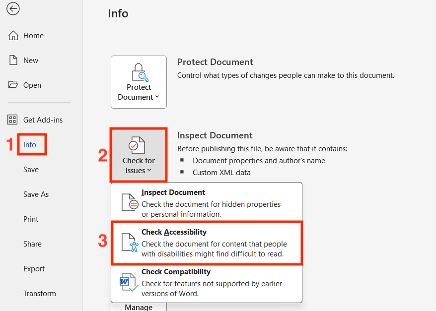
- Click a specific issue to see Additional Information and steps you can take to change the content.
Mac Users:
- Open the Review tab in the ribbon.
- Click Check Accessibility.
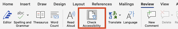
- The Accessibilty Assistant window will open on the right side of the screen.
- Click a specific issue to see more information and steps you can take to change the content.
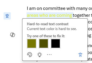
Accessibility Checker Issues
The Accessibility Checker checks a file against a set of possible issues that people who have disabilities might experience in the file. Each issue is classified as an Error, Warning, or Tip.
- Error: An error is for content that makes a file very difficult or impossible for people with disabilities to understand.
- Warning: A warning is for content that in most, but not all, cases makes a file difficult for people with disabilities to understand.
- Tip: A tip is for content that people with disabilities can understand, but that might be better organized or presented in a way that would improve their experience.
NEW: Inline Accessibility Assistant for Microsoft Word
Microsoft has recently released a new option within MS Word to help users with creating accessible materials. The inline accessibility assistant flags issues with content you have just created and suggests corrective options to apply as a fix. Try turning this on to utilize an accessibility assistant that helps you identify and remediate issues as you create your document!
HOW TO: Turn on Inline Accessibility Assistant
Windows Users:
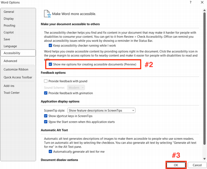
- Open the Options menu in Word (File > Options):
- In the Accessibility window, check the box "Show me options for creating acessible documents (Preview)" .
- Click OK to save and close the Options menu.
Mac Users:
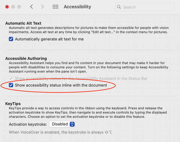
- From the Preferences menu, select "Accessibility".
- In the Accessible Authoring section, check the box "Show accessibility status inline with the document".
Creating PDFs in Word
The easiest way to ensure that your PDF is accessible is to create the PDF within Office using the export instructions below.
Methods to Avoid:
DO NOT use Print to PDF or "Save As" PDF to convert your Word documents. These methods lose some of the accessibility information and are often harder to review and repair in Acrobat Pro.
HOW TO: Export Word Documents as PDFs
Windows Users:
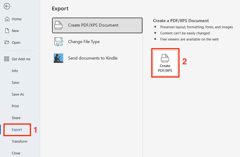
- Click the File tab, and then click Export.
- Select the Create PDF/XPS icon.
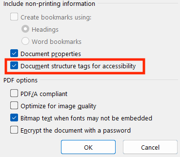
- In the export dialog, click Options.
- Make sure that the "Document structure tags for accessibility" check box is selected, and then click OK. If the option is available (not grayed out), also select "Create bookmarks using - Headings."
- Click Save
MAC Users:
IMPORTANT: To export a PDF form Word on a Mac, you must first have Adobe Acrobat Pro installed on your machine and be logged into Adobe's Creative Cloud service. This is the only way to preserve the accessibility features of your source document.
When you install Acrobat Pro on your computer, Adobe will also install an add-in that allows you to create a PDF without leaving Word or PowerPoint. You will know it is installed when you see the Acrobat tab on the application’s ribbon.
- In the Acrobat tab in the ribbon, click "Create PDF".
- The Adobe Acrobat application will then open with your newly created PDF file.
- Save your file.